Height and Width Properties in CSS
The height and width properties in CSS are used to specify the dimensions of an element, such as a div, image, or text container. The min-width, max-width, min-height, and max-height properties define minimum and maximum boundaries when it is necessary to constrain a width or height from expanding or contracting past a cer tain point. In a variable width design, where you design content to adapt to multiple screen resolutions, it is sometimes helpful to define where you want the document to stop stretching or stop contracting For instance, if you have designed primarily with an 800 x 600 or 1024 x 768 screen resolution in mind, a user viewing your website at 1600 x 1200 pixels may see the content stretched pretty thin if an auto key- word or percentage values are used to define the width. This is where the CSS properties min-width, max-width, min-height, and max-height come into play. The height property determines the vertical size, while the width property defines the horizontal size of the element. By adjusting these properties, developers can control the space occupied by an element within its parent container.
Example:
Let’s consider an example where we want to create a responsive image container. We can use the height and width properties to achieve this. Here’s the CSS code for the example:
.image-container {

height: 300px;

width: 100%;

}
In the above code, we set the height of the image container to 300 pixels using the height property. The width property is set to 100% to ensure that the container expands horizontally to occupy the entire width of its parent element. This allows the image to resize proportionally within the container, maintaining its aspect ratio.
Developers can also use other units of measurement, such as pixels, percentages, ems, or rems, to define the height and width of elements based on specific design requirements.
Maximum Width in CSS:
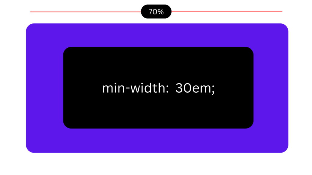
The maximum width property allows developers to set a limit on the maximum width an element can attain. By defining a maximum width, web designers can ensure that content remains within a specified boundary, preventing it from overflowing or becoming too wide. This article will explore the concept of maximum width in CSS and provide examples to illustrate its usage.
Understanding Maximum Width:
The maximum width property in CSS enables developers to impose a constraint on the width of an element. It ensures that the element does not exceed a specified width value, providing control over content layout and preventing unwanted horizontal overflow. By setting a maximum width, web designers can maintain readability and optimize the user experience across different devices and screen sizes.
Example:
Let’s consider a scenario where we want to ensure that an image does not become too large and maintains a maximum width of 500 pixels. We can achieve this using the max-width property in CSS. Here’s an example:
.image-container {

height: 300px;

width: 100%;

}
In the code above, we target all <img> elements and set the max-width property to 500 pixels. This ensures that regardless of the original size of the image, it will not exceed the specified width. If the image is smaller than 500 pixels, it will be displayed at its original size. However, if the image is larger, it will be automatically scaled down to fit within the maximum width constraint.
The maximum width property is not limited to images; it can be applied to any block-level or inline-level element. For instance, let’s say we want to create a centered container with a maximum width of 800 pixels. We can achieve this as follows:
.container {

max-width: 800px;

margin-left: auto;

margin-right: auto;

}
In this example, we define a CSS class .container and set the max-width property to 800 pixels. By adding margin-left: auto and margin-right: auto, we center the container horizontally on the page. This ensures that the content within the container does not exceed the specified maximum width, creating a visually pleasing layout.
Conclusion:
The maximum width property in CSS provides developers with a means to set limits on the width of elements. By imposing a maximum width constraint, content can be effectively managed, preventing overflow and ensuring optimal display across devices. Whether applied to images, containers, or other elements, maximum width allows for greater control and consistency in web design.
Maximum Height in CSS:
The opposite of the min-height property is the max-height property, which allows the author to tell the browser when an element should stop expanding. It allows an upper height constraint to be specified for the element. The max-height property is outlined in the following table.
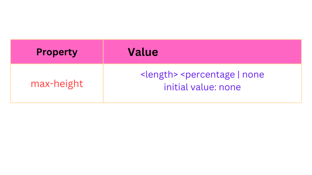
IE 6 does not support the max-height property.
The max-height property does for height what the max-width property does for width. Unfortunately there is no workaround for the max-height property in IE 6, but this property is implemented in IE 7. Figure is a demonstration of the max-height property.
Using the max-height Property:
In CSS, the max-height property is employed to set the maximum height of an element. It accepts various units of measurement, such as pixels, percentages, and viewport units. By specifying a value for max-height, developers can enforce height limitations on elements, allowing for a more controlled and predictable layout.
Example:
Consider a div element containing a lengthy article that needs to be displayed within a constrained space. We can use the max-height property to limit the height of the div and enable scrolling for content that exceeds the defined maximum height. Here’s an example of CSS code:
.article-container {

max-height: 300px;

overflow: auto;

}
In the above code, we set the max-height property to 300 pixels for the “.article-container” class. This ensures that the div element will not exceed a height of 300 pixels. If the content within the div surpasses this limit, a vertical scrollbar will appear, allowing users to scroll through the content.
Conclusion:
The max-height property in CSS provides developers with the ability to set an upper limit for the height of an element, ensuring content remains within a specified range. By utilizing this property, designers can maintain control over layout, prevent overflow, and create consistent and visually pleasing web experiences.
Minimum Height in CSS:
The minimum height property allows to define the minimum height for an element. This ensures that the element will always be displayed at least as tall as the specified minimum height, even if its content is insufficient. In this article, we will explore the concept of minimum height, understand its usage, and provide practical examples to demonstrate its application. If you are using a variable or percentage height, the min-height property lets you specify when you want the element to stop shrinking vertically. The following table outlines the possible values for the min-height property.
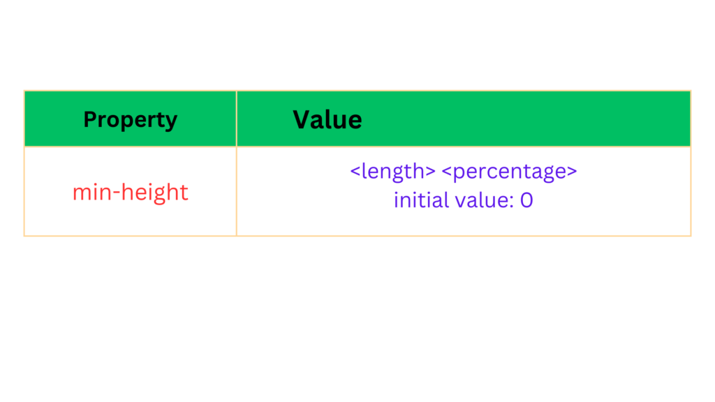
IE 6 supports the min-height property only when used on <td>, <th>, and <tr> elements.
Example:
Let’s consider a common scenario where we want to create a card-like container with a minimum height to accommodate varying amounts of content. We can achieve this using the minimum height property. Here’s the CSS code for the example:
.card {

min-height: 200px;

background-color: #f2f2f2;

padding: 20px;

}
In the above code, the .card class represents the container element. By setting the min-height to 200 pixels, we ensure that the container will always be at least 200 pixels tall, regardless of the content it contains. This prevents the container from collapsing and maintains consistent visual presentation across different instances.
Conclusion:
The minimum height property in CSS provides developers with control over the minimum visible height of elements. By setting a minimum height value, developers can ensure that elements maintain a certain height, regardless of their content. This property is particularly useful in situations where layout consistency and visibility are crucial.
Minimum Width in CSS:
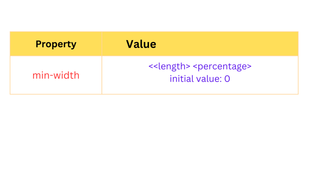
The minimum width property enables developers to set a threshold for the minimum width of an element. By defining a minimum width, web designers can ensure that content remains visible and accessible, even when the viewport or container size is reduced. In this article, we will explore the concept of minimum width, its significance in responsive design, and provide examples of its usage. The min-width property defines a lower-size constraint on an element. The available values for the min-width property are outlined in the following table.
Example:
Consider a responsive card component that contains text and an image. To ensure that the card remains readable and the content is not obscured, a minimum width can be set. Here’s an example using CSS:
.card {

min-width: 300px;

/* other styling properties */

}
In this case, the card element will never shrink below 300 pixels in width, regardless of the available space. This guarantees that the content within the card remains visible and legible, even on smaller screens or when the card is placed within a narrow container.
Conclusion:
The minimum width property in CSS plays a crucial role in maintaining content visibility and readability in responsive web design. By setting a minimum width, developers ensure that elements do not become too compact or collapse, preserving the integrity of the content. Applying minimum width appropriately allows for a consistent user experience across different devices and screen sizes.
Width in CSS:
The width property is a pretty simple property; it sets the width of an element. According to the CS5box model diagram presented in Figure, width is the space measured from inside padding edge to inside padding edge. The following table outlines the width property and its possible values.
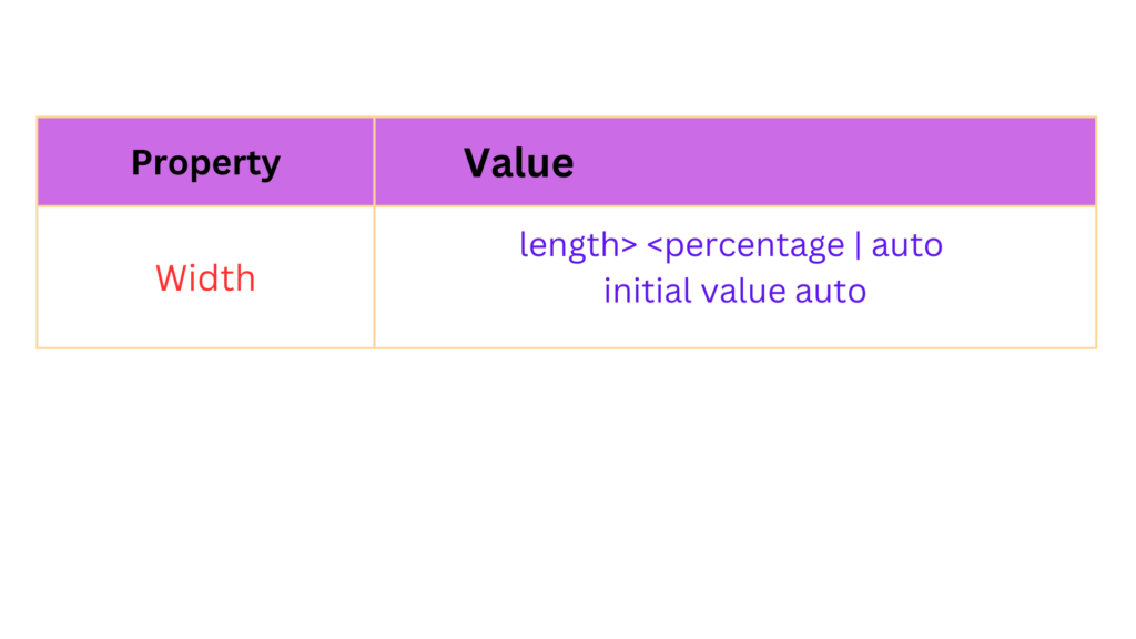
The width property accepts a length unit, which is indicated in the preceding table with the <length>notation. In Figure , you see a simple example of the width property using a length unit.
The CSS in Figure is combined with the markup in Figure.
body {

margin: 0;

peddings 0: fonts 17px sans-serif;

diviwrapper (

border: 1px solid whiter

background: gold;

width: 200px;

}

div box (

margin: 5px;

border: 5px solid khaki; background: yellow; padding: 5px; width: 250px;

} div#inner {

background: white; text-align: justify;

}
Similarly, to set the width of an image to occupy 50% of its parent container, the CSS code would be:
img {

width: 50%;

}
The width property provides flexibility in designing responsive layouts and controlling the size of elements on a webpage.
Height in CSS:
Like the width property, the height property sets the amount of space between the top-inside padding edge and the bottom-inside padding edge. The following table outlines the height property and its pos- sible values.
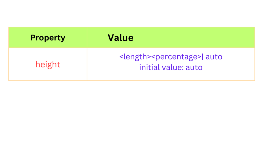
The height property causes an element to behave somewhat differently than its HTML height attribute counterpart in standards-compliant browsers. When you explicitly specify a height, the height remains the same regardless of how much text you place inside the element. Figure 7-32 is an example of what happens when there is more content than the height allows. Figure 7-32a is combined with the tongue twister in Figure 7-32b.
body {

margin: 0;

padding: 0;

fonts 12px sans-serif;

}

div@vrapper {

border: 1px solid white; background: gold;

width: 130px;

}

div#box {

margin: 5px;

border: 5px solid khaki;

background: yellow; padding: 5px;

height: 130px;

}

div#inner {

background: white;

text-align: justify;

}
Example:
Let’s consider an example where we want to set the height of a div element to a fixed pixel value:
div {

  height: 200px;

}
In the above code, the height property is applied to a div element, and a value of 200 pixels is assigned to it. This ensures that the div will have a fixed height of 200 pixels, regardless of its content.
We can also use percentage values to make the height relative to the parent container. For instance:
.container {

height: 50%;

}


.child {

height: 100%;

}
In this example, the height of the container div is set to 50% of its parent’s height. The child div, nested within the container, will inherit this height value and occupy the entire height of its parent.
Furthermore, the height property can be used in combination with other CSS properties to create responsive designs. For instance:
.container {

height: 100vh;

}


.image {

max-height: 80%;

}
In this example, the container div is set to occupy 100% of the viewport height (100vh). The image element within the container is then given a maximum height of 80% relative to its
parent container. This allows the image to scale dynamically and maintain its aspect ratio while adapting to different viewport sizes.
Conclusion:
The height property in CSS enables developers to control the vertical size of elements on a web page. Whether setting fixed pixel values, using percentages for relative heights, or employing viewport units for responsive designs, understanding and utilizing the height property effectively is essential for creating visually appealing and responsive web layouts.
