Buttons and Anchors in CSS
Buttons and Anchors play a crucial role in web design, facilitating user interaction and navigation. Cascading Style Sheets (CSS) provides extensive options for styling these elements, allowing developers to customize their appearance, hover effects, and overall behavior. In this article, we will explore the techniques and best practices for styling buttons and anchors in CSS, along with practical examples.
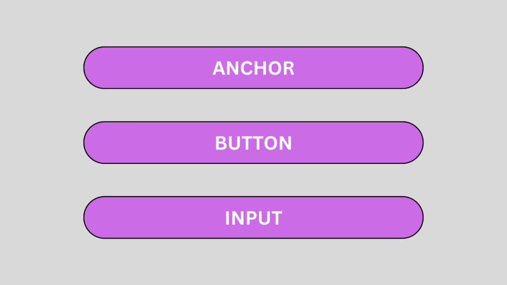
Having CSS that is modular and reusable makes it organized and concise, thereby avoiding situations where you may feel like pulling your hair out. Wouldn’t it be awesome to just add the class of button to an anchor element, no matter where that anchor element is in your markup, and have it transform into a button? CSS is “reusable” if you’re able to use its classes anywhere and don’t need these classes to be qualified by parent elements as long descendant selectors. The term “modular” refers to the ability to add variations to the button by adding another class to it so that one element can have two classes that could come together to form something very different.
A good example of how to write modular and reusable CSS is this: creating buttons. However, this concept should be applied everywhere, across all components of your website. We have a lot to go over in this chapter. We will cover modular CSS and multiple classes in the first two sections, before we switch gears and talk about how selectors can overrule each other in the specificity rules section. We’ll then get into CSS3 pretty heavily with transitions, transforms, and gradients, and we’ll go through every step of creating and styling a big call-to-action button.
Styling Buttons:
Buttons are essential for initiating actions and interactions on web pages. CSS offers multiple properties to customize button styles, such as background-color, color, border, padding, and more.

Example:
.button {

  display: inline-block;

  padding: 10px 20px;

  background-color: #4CAF50;

  color: #fff;

  border: none;

  text-align: center;

  text-decoration: none;

  font-size: 16px;

  cursor: pointer;

  border-radius: 4px;

}


.button:hover {

  background-color: #45a049;

}


.button:active {

  background-color: #3e8e41;

}
In the above code snippet, we define a class named “button” and apply various styles. We set the background color to a shade of green, the text color to white, and remove the button’s border. The padding ensures proper spacing, and the text-align property centers the text within the button. The cursor property changes the cursor to a pointer when hovering over the button, indicating interactivity. The border-radius adds a slight curve to the button’s corners. The :hover pseudo-class modifies the background color on hover, providing visual feedback to the user. The :active pseudo-class alters the background color when the button is clicked, giving an additional interactive effect.
Turning Links into Buttons:
As far as the XHTML code is concerned. It’s simply a list of links. There’s nothing special here that makes this act like a group of buttons, except the creation of a div called menu. All the real work is done in CSS:
#menu li {

list-style-type: none;

width: 5em;

text-align: center; margin-left: -2.5em;

}

#menu a {

text-decoration: none;

color: black; display: block;

border: 3px blue outset; background-color: #CCCCFF:

}

#menu a:hover {

border: 3px blue inset:

}
The process for turning an ordinary list of links into a button group like this is simply an application of CSS tricks:
1. Begin with an ordinary list that will validate properly.
It doesn’t matter if you use an unordered or ordered list. Typically, the list will contain anchors to other pages. In this example, I’m using this list of links to some popular Web sites:
<div id="menu

<ul>

<li><a href="http://www.google.com">Google</a></li> <li><a href="http://www.wiley.com">Wiley</a></li>

<li><a href= http://www.wikipedia.org>Wikipedia</a></li>

<li><a href= "http://www.reddit.com'>Reddit</a></b>

</ul>

</div>
2. Enclose the list in a named div.
Typically, you’ll still have ordinary links on a page. To indicate that these menu links should be handled differently, put them in a div named menu. All the CSS-style tricks described here refer to lists and anchors only when they’re inside a menu div.
3. Remove the bullets by setting the list-style-type to none.
This will take away the bullets or numbers that usually appear in a list, as these features will distract from the effect you’re aiming for (a group of buttons). Use CSS to specify how list items should be formatted when they appear in the context of the menu ID:
#menu li ( list-style-type: none:

width: 5em;

text-align: center

margin-left-2 5em;

}
4. Specify the width of each button:
width: 5em;
A group of buttons looks best if they’re all the same size. Use the CSS width attribute to set each li to 5em.
5. Remove the margin by using a negative margin-left value, as shown here:
margin-left: -2. 5em;
Lists have a default indentation of about 2.5em to make room for the bullets or numbers. Because this list won’t have bullets, it doesn’t need the indentations. Overwrite the default indenting behavior by setting margin-left to a negative value.
6. Clean up the anchor by setting text-decoration to none and setting the anchor’s color to something static, such as black text on light blue in this example:
#menu a {

text-decoration: none;

color: black: display: block;

border: 3px blue outset;

background-color: #CCCCFF;

}
The button’s appearance will make it clear that users can click it, so this is one place you can remove the underlining that normally goes with links.
7. Give each button an outset border, as shown in the following:
border: 3px blue outset:
The outset makes it look like a 3D button sticking out from the page. This is best attached to the anchor, so you can swap the border when the mouse is hovering over the button.
8. Set the anchor’s display to block.
This is a sneaky trick. Block display normally makes an element act like a block-level element inside its container. In the case of an anchor, the entire button becomes clickable, not just the text.
Styling Anchors:
Anchors, denoted by the <a> HTML tag, are used for hyperlinks and navigation. CSS allows developers to style anchors similarly to buttons, with the addition of specific properties for link behavior.

Example:
a {

color: #007bff;

text-decoration: none;

}


a:hover {

text-decoration: underline;

}


a:visited {

color: #4e93d2;

}
In the above code, we set the color property to a shade of blue for unvisited links. The text-decoration property is set to none, removing the default underline for links. The :hover pseudo-class adds an underline effect when hovering over the link, giving visual feedback. Additionally, the :visited pseudo-class changes the link’s color to a different shade of blue after it has been visited.
III. Styling Buttons as Anchors:
In some cases, it may be desirable to style buttons as anchors to achieve a consistent visual appearance. This approach is particularly useful when buttons need to be part of navigation menus or have hyperlink functionality. By applying similar styles to buttons and anchors, a cohesive design can be maintained. Here’s an
Example:
<a href="#" class="button">Click me</a>
In the above code, we apply the “button” class to an anchor element, giving it the appearance of a button. The CSS styles defined for the “.button” class can be reused for both button and anchor elements, ensuring a consistent and visually appealing interface.
Conclusion:
Styling buttons and anchors in CSS allows developers to enhance the interactivity and user experience of web pages. By utilizing properties like background-color, color, border, padding, and pseudo-classes like :hover and :active, buttons and anchors can be customized to align with the desired design aesthetics. This not only improves visual appeal but also provides clear visual feedback to users, enhancing the overall usability of the website.
These are truly wonderful ideas in on the topic of blogging.
You have touched some pleasant things here. Any way keep up wrinting.