Font Properties In CSS
As the authors of CSS clearly recognized from the outset, font selection is a popular, indeed crucial, feature of web design. In fact, the beginning of the “Font Properties” section of the CSSI specification begins with the sentence, “Setting font properties will be among the most common uses of style sheets.” The intervening years have done nothing to disprove this assertion.
CSS2 added the ability to specify custom fonts for download with @font-face, but it wasn’t until about 2009 that this capability really began to be widely and consistently supported. Now, websites can call on any font they have the right to use, aided by online services such as Fontdeck and Typekit. Generally speaking, if you can get access to a font, you can use it in your design.
It’s important to remember, however, that this does not grant absolute control over fonts. If the font you’re using fails to download or is in a file format the user’s browser doesn’t understand, then the text will be displayed with a fallback font. That’s a good thing, since it means the user still gets your content, but it’s worth bearing in mind that you cannot absolutely depend on the presence of a given font, and should never deign as if you can.
Font-Size:
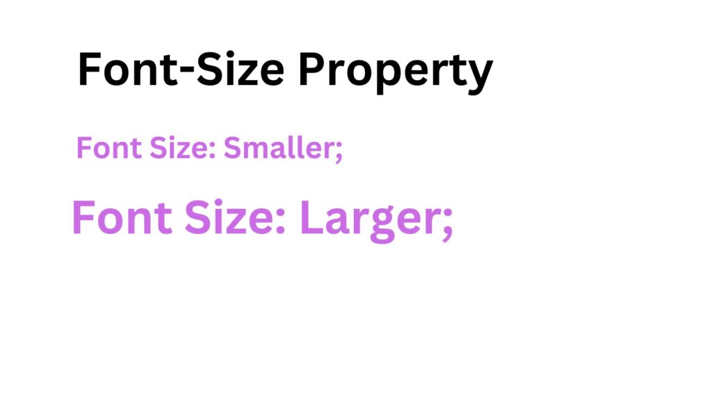
The “font-size” property in CSS allows web developers to control the size of text displayed on web pages. It plays a crucial role in determining the readability, accessibility, and overall aesthetics of the content. In this section, we will discuss the various aspects of font size in CSS, including units of measurement, relative sizing, responsive design considerations, and best practices.

I. Units of Measurement
CSS provides different units of measurement to specify font sizes. The most commonly used units are pixels (px), percentages (%), ems (em), and rems (rem).
- Pixels (px): It provides a fixed size that remains consistent across devices and browsers, but it may not be as flexible for responsive design.
- Percentages (%): It allows font sizes to scale relative to the parent element’s font size. However, it can lead to unpredictable results if nesting elements with different font sizes.
- Ems (em): It sets the font size relative to the parent element’s font size. This unit is useful for building modular and scalable designs.
- Rems (rem): Similar to ems, rem units set the font size relative to the root element’s font size (usually the <html> element). It offers a more predictable and consistent approach for responsive design.
II. Relative Sizing
Relative font sizing is a powerful technique that provides flexibility and consistency across different devices and screen sizes. It allows for the creation of responsive designs that adapt to various viewports. Relative sizing is typically achieved using ems or rems.
Example:
suppose we have the following CSS code,
body {

font-size: 16px;

}


h1 {

font-size: 2em;

}


p {

font-size: 1.2em;

}
In this example, the <body> element has a font size of 16 pixels. The <h1> element will have a font size of 2 times the parent’s font size (32 pixels), while the <p> element will have a font size of 1.2 times the parent’s font size (19.2 pixels). By using relative sizing, the text will scale proportionally when the parent font size changes, providing a consistent visual hierarchy.
III. Responsive Design Considerations
With the increasing variety of devices and screen sizes, it is crucial to consider responsive design when setting font sizes. CSS provides media queries and viewport units to ensure optimal text display across different devices.
Media queries allow developers to apply specific CSS rules based on the characteristics of the device, such as screen width. By adjusting font sizes within media queries, we can optimize readability and maintain a harmonious layout across various screen sizes.
Viewport units, such as “vw” (viewport width) and “vh” (viewport height), allow font sizes to scale proportionally to the size of the viewport. For example, setting a font size of 5vw means that the text will be 5% of the viewport width. This approach ensures that text remains legible on both small mobile screens and large desktop displays.
IV. Best Practices
When working with font sizes in CSS, it is essential to follow best practices to ensure a positive user experience:
- Maintain readability: Choose font sizes that are comfortable to read across different devices and screen resolutions. Test readability on various devices to ensure optimal legibility.
- Use a modular and scalable approach: Utilize relative units (ems or rems) for font sizing, allowing for flexible and consistent typography within different elements and viewports.
- Consider accessibility: Ensure that font sizes meet accessibility guidelines, such as providing options for users to adjust text size or using relative units to accommodate different user preferences.
- Test and iterate: Test font sizes on different devices and screen sizes to identify any issues and make necessary adjustments. Continuously iterate and refine the font sizes based on user feedback and analytics.
Conclusion:
The “font-size” property in CSS is a crucial tool for controlling text size on web pages. By understanding the different units of measurement, utilizing relative sizing techniques, considering responsive design, and following best practices, web developers can create visually appealing and user-friendly websites. It is essential to strike a balance between readability, aesthetics, and responsiveness to ensure that the text is legible and accessible across various devices and screen sizes. Experimenting, testing, and iterating are key to finding the optimal font sizes that enhance the overall user experience.
Font Family:
What we think of as a “font” is usually composed of many variations to describe bold text, italic text, and so on. For example, you’re probably familiar with (or at least have heard of) the font Times. However, Times is actually a combination of many variants, including TimesRegular, TimesBold, TimesItalic, TimesBoldItalic, and so on. Each of these variants of Times is an actual font face, and Times, as we usually think of it, is a combination of all these variant faces. In other words, Times is actually a font family, not just a single font, even though most of us think about fonts as being single entities.

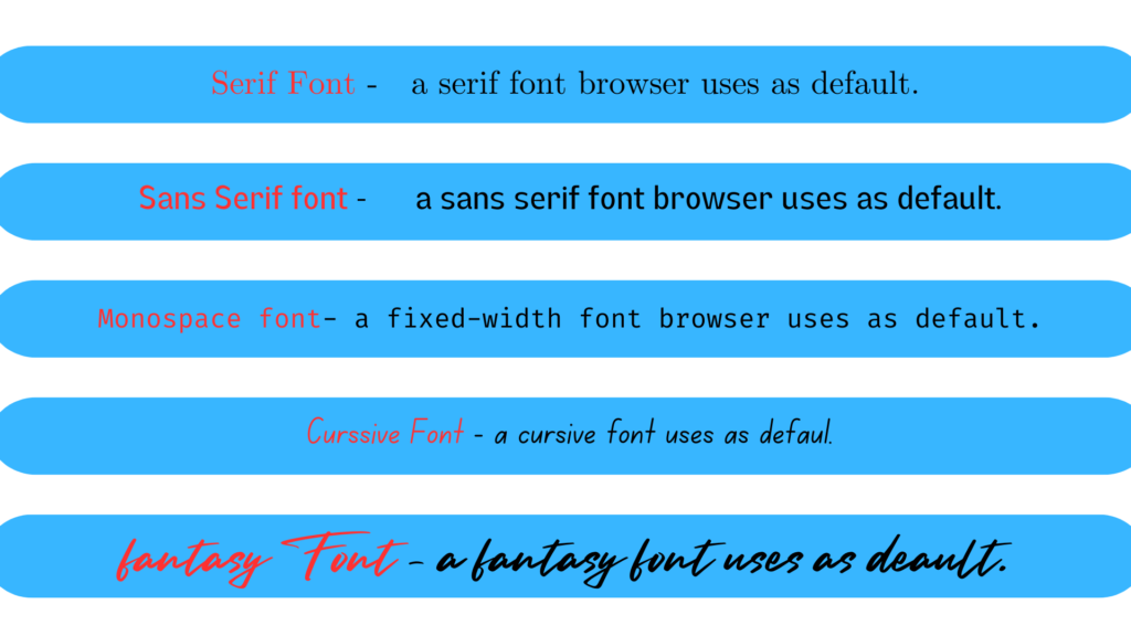
In order to cover all the bases, CSS defines five generic font families:
Serif fonts:
These fonts are proportional and have serifs. A font is proportional if all characters in the font have different widths due to their various sizes. For example, a lowercase i and a lowercase m are different widths. (This
book’s paragraph font is proportional, for example.) Serifs are the decorations on the ends of strokes within each character, such as little lines at the top and bottom of a lowercase 1, or at the bottom of each leg of an uppercase
A. Examples of serif fonts are Times, Georgia, and New Century Schoolbook.
Sans-serif fonts:
These fonts are proportional and do not have serifs. Examples of sans-serif fonts are Helvetica, Geneva, Verdana, Arial, and Univers.
Monospace fonts:
Monospace fonts are not proportional. These generally are used for displaying programmatic code or tabular data. In these fonts, each character uses up the same amount of horizontal space as all the others; thus, a lowercase i takes up the same horizontal space as a lowercase m, even though their actual letterforms may have different widths. These fonts may or may not have serifs. If a font has uniform character widths, it is classified as monospace, regardless of the presence of serifs. Examples of monospace fonts are Courier, Courier New, Consolas, and Andale Mono.
Cursive fonts:
These fonts attempt to emulate human handwriting or lettering. Usually, they are composed largely of flowing curves and have stroke decorations that exceed those found in serif fonts. For example, an uppercase A might have a small curl at the bottom of its left leg or be composed entirely of swashes and curls. Examples of cursive fonts are Zapf Chancery, Author, and Comic Sans.
Fantasy fonts:
Such fonts are not really defined by any single characteristic other than our inability to easily classify them in one of the other families (these are sometimes called “decorative” or “display” fonts). A few such fonts. are Western, Woodblock, and Klingon.
In theory, every font family will fall into one of these generic families. In practice, this may not be the case, but the exceptions (if any) are likely to be few and far between, and browsers are likely to drop any fonts they cannot classify as serif, sans-serif, monospace, or cursive into the “fantasy” bucket.
Font Family Examples:
Let’s consider a few examples to illustrate the usage of the font-family property:
Example 1:
Applying a Common Font Family
body {

font-family: Arial, sans-serif;

}
In this example, the font family “Arial” is specified as the first preference. If Arial is not available, the browser will use a generic sans-serif font, such as Helvetica or Verdana. Using generic font families as fallback options ensures that the text remains readable, even if the preferred font is not present on the user’s system.
Example 2:
Applying Multiple Font Families
h1 {

font-family: "Segoe UI", Tahoma, Arial, sans-serif;

}
In this example, the “Segoe UI” font is specified as the first preference for the heading (h1) element. If “Segoe UI” is not available, the browser will attempt to use the Tahoma font, followed by Arial, and finally a generic sans-serif font.
Best Practices for Font Family Selection:
- Provide a list of font families: Specify multiple font families in the font-family property to increase the chances of finding an appropriate font on different devices and platforms.
- Use web-safe fonts: Include commonly available fonts (such as Arial, Helvetica, Times New Roman, etc.) in your font-family list to ensure consistent rendering across various systems.
- Consider licensing and performance: If you want to use custom or web fonts, ensure you have the proper licensing and consider the impact on page load times.
- Test across different browsers and devices: Check the rendering of your chosen font family across various browsers and devices to ensure consistency and readability.
- Maintain readability and accessibility: Choose font families that are legible and consider accessibility guidelines, such as providing sufficient contrast between text and background.
Conclusion:
The “font-family” property in CSS is a powerful tool for customizing the typeface used in web content. By specifying font families in order of preference and considering fallback options, developers can create visually appealing and readable text. Additionally, it is important to test font rendering across different browsers and devices, adhere to accessibility guidelines, and consider performance implications when using custom or web fonts. By following these best practices, developers can ensure a consistent and engaging typographic experience for their users.
Font Weight:
The font-weight property provides the functionality to specify how bold a font is. The following tableoutlines the font-weight property and the values that it allows.
The font-weight property is used to specify how bold or how light a font appears, as is demonstrated by the following example,
<p style='font-weight: normal;

This font is normal.

</p> <p style='font-weight: bold;">

This font is bold. </p>

<p style="font-weight: bolder;'>

This font is bolder.

</p>

<p style='font-weight: lighter;"> This font is lighter.

</p>

<p style='font-weight: 100, This font is 100 weight.

</p>

<p style="font-weight: 2001> This font is 200 weight.

<p style='font-weight: 300>

This font is 300 weight.

/p

<p style="foot-weight 400;"> This font in 400 weight.

</p> <p style='font-weight: 500

This font is 500 weight.

<p style='font-weight: 600;'> font is 600 weight.

This

<p style='font-weight: 700;'>

This font is 700 weight.

<p style='font-weight: 800;'>

This font is 800 weight. >

<p style='font-weight: 900;' This font is 900 weight.
1.Numeric Values:
The “font-weight” property can accept numeric values ranging from 100 to 900. These values represent different levels of thickness, with 400 typically being the regular or normal weight, and 700 representing bold text.
For Example:
p {

font-weight: 300; /* Light weight */

}


h1 {

font-weight: 700; /* Bold weight */

}
2.Predefined Keywords:
CSS also provides predefined keywords for font weight, making it more intuitive and easier to use. The most commonly used keywords are “normal” and “bold”.
For Example:
p {

font-weight: normal; /* Regular weight */

}


h1 {

font-weight: bold; /* Bold weight */

}
3.Relative Keywords:
CSS introduced relative font weight keywords to offer more granular control. The keywords “lighter” and “bolder” adjust the font weight relative to the inherited weight of the parent element.
For Example:
p {

font-weight: lighter; /* Lighter than the inherited weight */

}


h1 {

font-weight: bolder; /* Bolder than the inherited weight */

}
Multiple Font Weights:
In some cases, font families provide font files with different weights. The “font-weight” property can be used to select a specific weight from a font family.
For Example:
h1 {

font-family: 'Open Sans', sans-serif;

font-weight: 800; /* Select the font weight 800 (Extra-Bold) from Open Sans */

}
It is important to note that not all font families support all font weights. If a specific font weight is not available, the browser will attempt to find the closest available weight.
By leveraging the “font-weight” property, developers can create visually appealing designs, improve the hierarchy of content, and provide emphasis where necessary. It is essential to strike a balance between readability and aesthetics when choosing font weights, ensuring that the text remains legible across different devices and screen sizes.
Font Stretch:
In some font families, there are a number of variant faces that have wider or narrower letterforms. These often take names like “Condensed,” “Wide,” “Ultra Expanded,” and so on. The utility of such variants is that a designer can use a single font family while also having skinny and fat variants. CSS provides a property that allows an author to select among such variants, when they exist, without having to explicitly define them in font-family declarations. It does this via the somewhat misleadingly named font- stretch.
font-stretch
Values:
normal | ultra-condensed | extra condensed | condensed | sent-condensed |
sent-expanded | expanded | extra-expanded | ultra-expanded | inherit
Initial value:
normal
Applies to:
All elements
Inherited:
Yes
Note:
Has a corresponding @font-face descriptor (see below)
You might expect from the property name that this will stretch or squeeze a font like saltwater taffy, but that’s actually not the case at all. As the value names imply, this property instead behaves very much like the absolute-size keywords (eg, xx-large) for the font-size property, with a range of absolute values that (in theory) let the author alter a font’s width. For example, an author might decide to stress the text in a strongly emphasized element by changing the font characters to a wider face than their parent element’s font characters.

Understanding Font Stretch
Font stretch refers to the horizontal width variation of characters within a font family. It enables developers to adjust the width of text independently of other font properties such as weight, style, or size. By using the font-stretch property, it is possible to create unique typographic effects and optimize text layout to fit specific design requirements.
Using the font-stretch Property
To control the font stretch, the font-stretch property is employed in CSS. It accepts various predefined keywords and numerical values. The keywords include “normal,” “wider,” “narrower,” and more, while the numerical values range from 50% (condensed) to 200% (expanded). By specifying the appropriate value, developers can manipulate the width of text to achieve the desired visual effect.
Example Usage:
Let’s consider an example where we want to display a heading with condensed text to save space within a navigation bar. We can use the font-stretch property to achieve this effect. Here’s the CSS code
Example:
h1 {

font-family: Arial, sans-serif;

font-size: 24px;

font-stretch: condensed;

}
In the above code, we set the font-family to Arial, which is a widely available sans-serif font. The font-size is specified as 24 pixels, but the crucial property here is font-stretch, which is set to “condensed.” This value narrows the characters, making them more compact horizontally.
Additionally, developers can use numerical values to achieve more precise control over font stretch. For instance:
p {

font-family: "Open Sans", sans-serif;

font-size: 16px;

font-stretch: 75%;

}
In this example, we set the font-stretch to 75%, which moderately compresses the characters of the text within the paragraph. This can be useful for emphasizing certain sections or fitting more content within a limited space.
Conclusion:
The font-stretch property in CSS offers developers the ability to adjust the width variation of text within a font family. By using predefined keywords or numerical values, font stretch can be expanded or condensed, providing flexibility in text presentation. Through the examples provided, it becomes evident that font stretch can be employed to create unique typographic effects, optimize space utilization, and enhance overall design aesthetics. Experimenting with font stretch, in conjunction with other font properties, empowers developers to craft visually appealing and customized text layouts that align with their specific design goals.